

Accessibility used to be the item at the bottom of the email checklist, the thing you got to if there was time. That is over. Since 28 June 2025 the European Accessibility Act has been in force, and the same alt text and contrast fixes that help a screen-reader user also decide whether your message survives with images turned off or trips a spam filter. Accessibility is now a reach problem, a legal problem, and a deliverability problem at once.
So start with what we actually measure. Across the emails run through Unspam, 84% pass their accessibility checks, which sounds healthy until you see where the failures cluster: missing language attributes, unmarked layout tables, low contrast, and missing alt text. That is the gap this guide closes. It is written for both halves of the room, the marketer who needs the what and the why, and the developer who needs the how, with real, copy-paste code where it matters.
What is email accessibility?
Email accessibility means building an email that everyone can perceive, operate, and understand, including people who use a screen reader, navigate by keyboard, zoom the text, read in dark mode, or have low vision or color blindness. In practice it is the WCAG 2.2 principles (perceivable, operable, understandable, robust) applied to the constraints of the inbox: real text over baked-in images, descriptive alt text, sufficient color contrast, semantic structure, and a declared language.
Unlike web accessibility, email accessibility works around inbox constraints: no external CSS, table-based layout, and clients that block images by default. The principles are the same, but the tactics are shaped by where the message lands.
Email accessibility best practices at a glance
These are the core practices, in the order most emails get them wrong. Each is expanded below with the how-to.
- Give every informational image descriptive
alttext, and give decorative ones an emptyalt="" - Structure the message with real
<h1>through<h6>headings, not bold styled text - Add
role="presentation"to every layout table so screen readers read content linearly - Meet color contrast: 4.5:1 for normal text, 3:1 for large text and UI elements
- Design for dark mode and test contrast in both modes
- Write link text that describes its destination, never "click here"
- Keep tap targets comfortable and body text at 14 to 16px
- Declare the language with
<html lang="en">and send a real plain-text part
What we see across the emails we test
Most accessibility guides argue from audience statistics: how many people have a disability. That is real, and it is covered below, but it is not evidence about your email. The numbers in this section are that evidence, because they come from the emails actually run through Unspam.
- 84% of the emails we check pass their accessibility checks. That is far more optimistic than the all-or-nothing "99.88% of emails fail" figure you may have seen quoted, and it is more useful: a graded score tells you most emails are already most of the way there, and the remaining gap is small and closable.
- When an email does fail, the misses cluster in a few predictable spots: a missing
langattribute, unmarked layout tables, low contrast, and missing alt text. - Our accessibility check specifically flags text that is invisible or unreadable for humans because of the text and background color it uses, in other words low color contrast. Its whole purpose is to give you an overview of where you stand and what to fix.
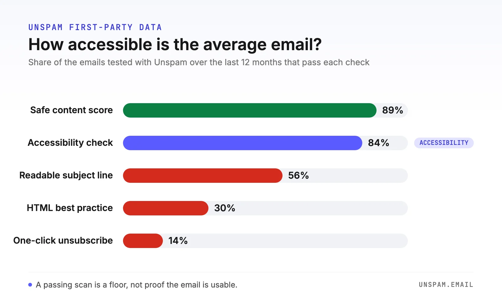
It helps to read that 84% next to the rest of what we measure. Content signals are consistently the weakest link: only 30% of emails pass our HTML best-practice checks, the lowest pass rate of anything we test. Accessibility, at 84%, is in far better shape than the HTML underneath your email, which tells you the wins are specific and targeted rather than a rebuild.
An empty alt attribute is a decision. A missing one is an accident that reads your filename aloud.
Why email accessibility matters
The audience is larger than you think
The reach case is straightforward. In the United States, more than one in four adults, 28.7% or over 70 million people, reported a disability in 2022 (CDC, from the 2022 BRFSS survey), with 5.5% reporting a vision disability specifically. Worldwide, the World Health Organization estimates at least 2.2 billion people have a near or distance vision impairment. Color blindness alone affects roughly 1 in 12 men and about 1 in 200 women of Northern European descent (Colour Blind Awareness). And a large share of email is opened on mobile, where small text and tiny tap targets fail everyone, not just people with a diagnosed impairment.
You do not need every one of these people to be blind for the work to pay off. A low-contrast headline is hard to read on a phone in sunlight for a fully sighted user too.
The legal picture
Accessibility law is now real enough that "we didn't know" is not a defense. Three regimes matter most to email senders, and they do not agree on the details.
| Regime | Who it covers | Standard | In force |
|---|---|---|---|
| European Accessibility Act (Directive (EU) 2019/882) | Businesses, including non-EU, selling covered products and services into the EU, e-commerce and electronic communications included | EN 301 549, which incorporates WCAG | Obligations apply since 28 June 2025 |
| ADA Title III (US) | US places of public accommodation, courts treat business websites and apps as covered | No codified WCAG standard; WCAG 2.1 AA is the de facto benchmark in settlements | ADA since 1990, web posture ongoing |
| ADA Title II (US) | US state and local government sites and apps | WCAG 2.1 AA (DOJ 2024 rule) | Extended deadlines: 26 April 2027 (pop. 50,000+), 26 April 2028 (smaller) |
| Section 508 (US) | US federal agencies and their vendors | WCAG 2.0 AA, one version behind Title II | Required since 18 January 2018 |
A few honest caveats. The EAA does not name "email marketing" as a category; its reach into email is indirect but real, strongest for transactional and service messages tied to a covered e-commerce or banking service, and grayer for purely promotional mail, where treatment depends on national transposition. ADA Title III has no fixed WCAG rule for private business; WCAG 2.1 AA is what courts and settlements use, not a statute. There is no certification that makes an email formally ADA compliant; conformance with WCAG 2.1 or 2.2 AA is what the phrase means in practice. And the US Title II government deadlines were extended by one year in April 2026, so the current dates are 2027 and 2028, not 2026 and 2027. The safe reading of all of this: build to WCAG 2.2 AA, and you clear the bar everywhere that has one.
The business case
Accessibility is not charity work you do at a cost. It overlaps almost entirely with the work that improves rendering and deliverability:
- Images-off resilience. Many clients block images by default. Descriptive alt text becomes your fallback copy, so the message survives intact whether the reader is blind or just has images turned off.
- Spam scoring. Filters distrust image-only mail. Real live text improves the text-to-image ratio, which helps both screen-reader users and your inbox placement at the same time.
- A real plain-text part. A genuine
multipart/alternativemessage with a propertext/plainpart serves text-only and assistive clients and improves inbox placement. It is one fix, two wins. - Engagement. Legible font size and strong contrast lift readability for everyone, which lifts the engagement signals mailbox providers reward. An email heatmap shows whether readers actually reach your CTA once the copy is legible.
WCAG for email: which criteria actually apply
Most guides name-drop WCAG A/AA/AAA and move on. Here is the concrete mapping, criterion by criterion, and how you satisfy each in an email.
| WCAG 2.2 criterion | Level | What it means in email | How to satisfy it |
|---|---|---|---|
| 1.1.1 Non-text Content | A | Images need text alternatives | Descriptive alt on informational images, alt="" on decorative ones |
| 1.3.1 Info and Relationships | A | Structure must be programmatic, not just visual | Real <h1> to <h6> headings, role="presentation" on layout tables |
| 1.4.3 Contrast (Minimum) | AA | Text must be readable against its background | 4.5:1 normal text, 3:1 large text |
| 1.4.11 Non-text Contrast | AA | UI and graphical objects must be distinguishable | 3:1 for buttons, icons, focus states |
| 2.4.4 Link Purpose | A | Link text must make sense out of context | Describe the destination, no bare "click here" |
| 2.5.8 Target Size (Minimum) | AA | Interactive targets must be big enough to hit | 24 x 24 CSS px minimum, or the spacing exception |
| 3.1.1 Language of Page | A | The reader's software must know the language | <html lang="en">, inline lang on foreign spans |
Two of these, contrast and target size, are pinned down in the design section below because they are the ones people cite wrong.
How to make an email accessible: content and structure
Real headings, not styled text
Screen-reader users navigate long content by jumping heading to heading. That only works if your headings are actual heading elements.
- Use
<h1>through<h6>for hierarchy, not a bold<span>or a big<td>that merely looks like a heading. - Use one logical
<h1>and nest downward without skipping levels. An<h2>followed by an<h4>breaks the scan-by-heading model and is a check we flag. - Keep source (DOM) order equal to reading order. Screen readers and linearized mobile rendering follow source order, not visual CSS position, so never rely on CSS to reorder meaning.
Descriptive links, never "click here"
A screen reader can pull up a list of every link in the message, read out of context. "Click here" five times is useless in that list.
- Write link text that names the destination: "read the deliverability checklist," not "read more."
- Avoid raw URLs as link text; they get read character by character.
- Keep the meaningful words inside the link, not around it.
Accessible email design
Color contrast and target size
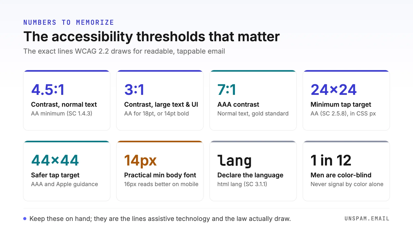
Contrast is the criterion Unspam's own check zeroes in on, flagging text that is effectively invisible against its background. The thresholds are exact, and they are thresholds, not targets you round up to: 4.499:1 fails 4.5:1.
| Content | WCAG AA minimum | WCAG AAA |
|---|---|---|
| Normal text (under 18pt / under 14pt bold) | 4.5:1 | 7:1 |
| Large text (18pt regular / 14pt bold and up) | 3:1 | 4.5:1 |
| UI components and graphical objects | 3:1 | n/a |
"Large text" has an exact definition shared by these criteria: 18pt regular (about 24px) or 14pt bold (about 18.66px). Anything smaller counts as normal text and owes the full 4.5:1.
Target size is the one everybody misstates. The WCAG 2.2 AA minimum (SC 2.5.8) is 24 x 24 CSS px, with a spacing exception for smaller targets that are not crowded by other targets. The famous 44 x 44 figure is stricter: it is WCAG AAA (SC 2.5.5) and the Apple Human Interface Guidelines minimum, not the AA requirement. So "WCAG requires 44 x 44" is a common error. Treat 24 x 24 as conformant and 44 x 44 as comfortably usable, and aim for the latter on any primary CTA.
- Never carry meaning with color alone. Pair a colored error state with an icon or label, and underline links so color blindness does not hide them.
- Give buttons a real, tappable size and generous padding, especially on mobile.
Typography and layout
- Set body text at 14 to 16px, with 16px preferred for mobile, and use larger sizes for headings.
- Use a single-column, responsive layout that reflows cleanly at zoom and on narrow screens. The same discipline shows up across current email design work.
- Keep lines to roughly 45 to 75 characters, which a single-column 600px layout at 16px hits naturally, and set line height around 1.5. Declare fallback fonts so an unsupported web font degrades to something legible.
Alt text done right
Missing alt text is one of the misses our check flags, and the fix is precise, not just "add alt everywhere."
- Informational images: describe the function or content, not the medium. Write
alt="Spring sale, 30% off all boots", notalt="banner image"and neveralt="image of...". - Decorative images: give them an explicit empty
alt=""(null alt) so screen readers skip them entirely. This is a spacer, a divider, a background flourish. - Do not omit
altentirely. A missing attribute is not the same as an empty one; some readers respond by announcing the filename or URL aloud, which is exactly the accident the pull-quote above described. - Remember alt text is also your images-off copy, so write it to keep the message intact when the picture never loads.
The flip side of alt text is not needing it in the first place. The fastest way to fail every check at once is the all-image email: a headline baked into a JPEG cannot be read by a screen reader, cannot reflow at zoom, cannot adapt to dark mode, and vanishes entirely with images off. Keep headlines, body copy, and buttons as live HTML text, and reserve images for what only an image can show.
Animation and GIFs
Animation has hard rules. Keep any GIF under three flashes per second, stop it after about three loops or five seconds, and put the full message in the first frame, because older Outlook versions only ever show frame one. For clients that support it, prefers-reduced-motion lets you swap in a static image for readers who have asked their device for less movement.
Accessible email code
This is the developer half. All of it is copy-paste.
role="presentation" on layout tables
Email still uses tables for layout. Left unmarked, a screen reader announces every row, column, and cell as data, which is noise. Mark every layout table so it reads linearly:
<table role="presentation" cellpadding="0" cellspacing="0" border="0" width="100%">
  <tr>
    <td>Your actual content, read in source order.</td>
  </tr>
</table>
role="none" is a synonym, but role="presentation" has the widest assistive-technology support, so prefer it. Apply it to every layout table, nested ones included.
lang (and dir) so the voice is right
Screen readers pick their pronunciation and voice profile from the document's declared language. With no lang, the reader falls back to its system default and mispronounces everything, French copy read with English phonetics, for example. Missing lang is one of the most common real-world defects across all email, and it costs one line to fix:
<html lang="en" dir="ltr">
For a right-to-left script, set dir="rtl". For mixed-language content, override per fragment with an inline attribute: <span lang="fr">merci beaucoup</span>.
Bulletproof, accessible CTAs
Build buttons as real links styled to look like buttons, sized for touch, with descriptive text inside the anchor:
<a href="https://example.com/checklist"
   style="display:inline-block; padding:14px 28px; font-size:16px;
          background:#1a4d8f; color:#ffffff; text-decoration:none;
          border-radius:6px;">
  Read the deliverability checklist
</a>
The link text carries meaning on its own, the padding gives it a comfortable target, and the color pairing clears 4.5:1.
Dark mode and accessibility
Dark mode is not one behavior, it is three, and each can break contrast in its own way: full inversion (background and text both flipped), partial inversion (text flipped, backgrounds mostly kept), and no change. The partial case is the dangerous one, because half-flipped palettes produce muddy, low-contrast combinations you never designed.
Signal your intent so aggressive auto-inversion backs off:
<meta name="color-scheme" content="light dark">
<meta name="supported-color-schemes" content="light dark">
Then pair it with the matching CSS color-scheme on your body. Two client quirks to code around:
- Apple Mail inverts pure
#000000and pure#FFFFFF. The workaround is near-black and near-white,#000001and#FFFFFE, visually identical but exempt from the forced flip. - Outlook desktop (Microsoft 365 on Windows) does full inversion, the most invasive mode, recoloring even dark designs. Outlook.com on the web does partial inversion, detecting light backgrounds and flipping them, and it adds
data-ogscanddata-ogsbattributes to your elements when it rewrites colors, which is what makes[data-ogsc]dark-mode targeting possible.
The rule that survives all of this: contrast still applies in dark mode. Preview your email in dark mode across real clients and test both modes against 4.5:1 and 3:1. Logos and icons on transparent backgrounds are the classic dark-mode failure, invisible the moment the background flips under them.
How screen readers handle Gmail, Outlook, and Apple Mail
The same accessible email is announced and rendered differently depending on the client and screen reader. This shapes what you optimize.
| Client and reader | What the inbox row announces | Inside the open message |
|---|---|---|
| Apple Mail + VoiceOver | Sender, subject, time received | Control-Option-J reads the message body |
| Outlook + VoiceOver (Mac) | Sender, subject, date, whether attachments exist | Left/Right arrows step through message content |
| Gmail (screen reader mode) | Moves between conversations with j/k or arrows; Enter or o opens | n reads each unread message oldest first |
The implication is practical: the subject line and preheader do heavy lifting because they are announced before the body is ever opened. Once the reader is inside, your headings and role="presentation" tables decide how navigable the body is.
Two details follow from that. If you use the hidden-preheader trick, the invisible padding characters that keep your body copy out of the inbox preview are not invisible to a screen reader; wrap the padding span in aria-hidden="true" so assistive tech skips it instead of reading a wall of nothing. And a screen reader announces every emoji by its full name, so a subject line that opens with two party poppers is heard as noise before your offer arrives. Use emoji sparingly, put them at the end of the subject or sentence, and never let one replace a word the message needs.
How to test email accessibility
Testing is where most guides wave a hand at a tool list. Here is the deeper version.
Run an automated check first
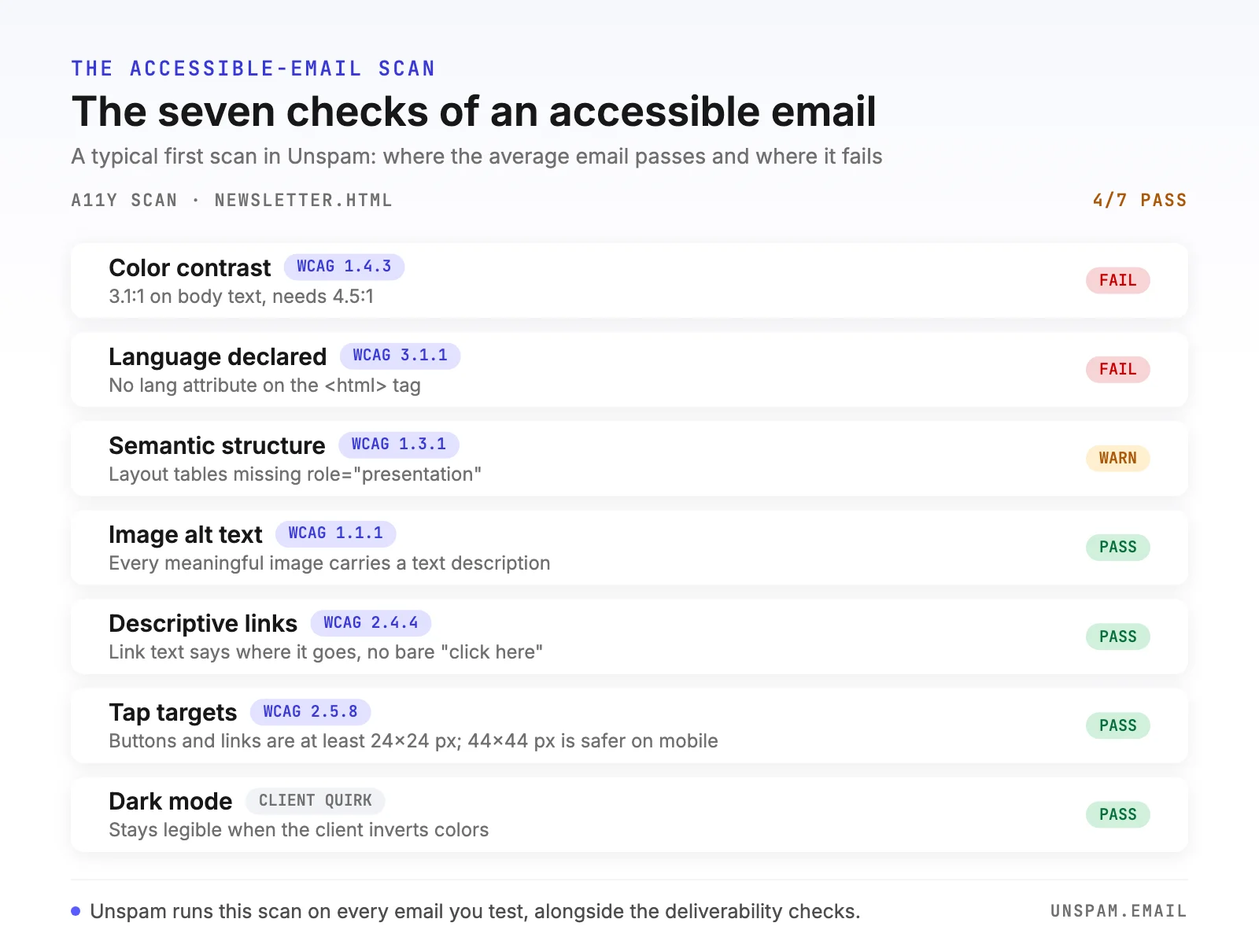
Start with the fast, repeatable pass. Unspam's accessibility check runs inside the free spam test at the homepage, modeling your email against WCAG 2.2 AA and scanning seven things at once: color contrast (target 4.5:1), image alt text, dark-mode behavior, heading order with no skipped levels, descriptive link text, tap-target size, and a declared lang attribute. It gives you a graded overview of where you stand and what to improve, rather than a single pass/fail verdict.
Pair it with the related content checks that overlap accessibility: the spam word checker for copy that hurts both readability and placement, and the email verifier to keep the list itself clean so your accessible mail actually reaches engaged people.
Then test with a real screen reader
Automated scores catch the mechanical failures. They cannot tell you whether your alt text actually makes sense read aloud. For that, test manually, ideally with the free readers built into the platforms your audience uses:
- Send yourself the email and open it in the target client.
- Turn on the screen reader (VoiceOver on Apple, NVDA on Windows, TalkBack on Android).
- Listen to the reading order. Does the message make sense linearly? Are headings announced as headings?
- Check that decorative images are skipped and informational ones read a useful description.
- Confirm links announce their destination out of context.
Keyboard and zoom checks
- Tab through the message. Every interactive element should be reachable and have a visible focus state.
- Zoom to 200%. Text should reflow in the single column without clipping or horizontal scrolling.
- View the email with images disabled and confirm the alt text carries the message alone.
What to fix first
If you only have an hour, spend it in this order. This ranking pairs our own data with the issue-frequency ranking from the Email Markup Consortium's 2026 accessibility report, which finds missing dir and missing lang are the most common real-world defects, ahead of layout tables without a role, low contrast, and missing alt text.
- Add the
lang(anddir) attribute. One line, near-universally missing, immediate win for every screen-reader user. - Mark every layout table
role="presentation". Turns a wall of table noise into linear content. - Fix missing alt text. A missing
altattribute drops the image silently; descriptive alt also protects you with images off. - Repair low color contrast. The check Unspam flags directly, and the one that fails sighted mobile users too.
- Replace styled text with real headings. Unlocks scan-by-heading navigation.
- Rewrite bare "click here" links. Cheap, and it makes your link list usable.
The email accessibility checklist (copy this)
- Every informational image has descriptive
alttext; decorative images havealt="" - Real
<h1>to<h6>headings in order, no skipped levels -
role="presentation"on every layout table - Text contrast at least 4.5:1 (3:1 for large text and UI elements)
- Meaning never carried by color alone
- Link text describes its destination, no "click here"
- Body text 14 to 16px, comfortable tap targets on CTAs
-
<html lang="...">declared,dirset for RTL -
color-schememeta set and both modes tested for contrast - A genuine
text/plainpart in amultipart/alternativemessage - Tested with a real screen reader, keyboard, zoom, and images off
Accessibility is not one big rebuild, it is this handful of habits applied before every send, and most of them help your deliverability at the same time. Want to know where your next campaign stands? Run a free spam test and read your accessibility score in about 30 seconds, no signup required.
