

Crafting a beautiful and impactful HTML email with a consistent user experience is a daunting task, even for experts. The deal is being less progressive than web browsers, mail providers do not agree with each other in what features they support and how they render them. As a result, you are left with a limited amount of tools and a bunch of issues and unexpected bugs. However, it does not mean that you cannot nail email development on your own.
The key to successful email development lies in adopting the best practices, sticking to standards, using safe options, and benefiting from time-tested tools. Dive into our guide to HTML email development best practices to find out how professional email marketers create successful email designs with a high deliverability rate, and impressive conversions without losing their nerve.
HTML Email Best Practices for Design
We will start with the design since it is the first thing your customers see, understand, and respond to. It stands behind conversions and open rates. According to studies, more than 90% of respondents look at visual appearance when deciding to buy. Therefore, much like the core and functionality of HTML email, the design has to be flawless. Let’s walk through the HTML email best practices to find out what are key aspects that you need to master.
HTML Email Check
Press play to load this video from YouTube (Google). See our cookie policy.
Know your Audience
Every email marketing campaign starts with defining your target audience and segmenting the subscription list accordingly. Although it seems that it has nothing to do with the design, in fact, it is the cornerstone of everything in email marketing software; and creating HTML email design is no exception.
Knowing your audience and, most importantly, what mail clients are in use is the base to build one. As we have already pointed out, email clients, including big names like Gmail, Outlook, Apple iOS, and Windows Mail, differ in support of HTML email features. Therefore, you need to know what solutions and properties to use to avoid the design crash.
Using analytics tools, you can define user’s habits and preferences in devices. This information may help you to create a design that is compatible with the email reader the best. Many small businesses that target the local crowd or a specific market benefit from this practice all the time.
However, what if you target the international market or need to serve data to all sorts of groups. So, you have to deal with the situation when a mix of email clients is involved. In this case, segmentation may help you define several types of devices you need to cover. Follow this simple 3-step procedure:
- First, define the primary email client, the most popular device among your subscribers.
- Second, create an HTML email design using features that are compatible with the primary email client.
- Third, test the email design in the lowest common denominator. Here you need to find a compromise to ensure that the design looks great in all situations.
This approach works great for the majority of mail readers, except for Outlook. The deal is, it is one of the most problematic email clients. It is tough to find a compromise, especially when the older versions are involved. It is just much easier to single out these subscribers and create an email design specifically for them. Therefore, if your users mostly employ Outlook, it is highly recommended to create a version only for this email reader and send it to the corresponding segment of subscribers.
What if this is your first campaign? What if you have never sent to this list of subscribers, or you simply do not have any information about device usage? Then follow this approach:
- Stick to safe options.
- Employ ten golden rules of good HTML email design.
- Do some research on your own. You can analyze the audience by yourself since email addresses give you hints about what mail clients subscribers are likely to use. For example, if they have accounts in Outlook.com, Yahoo, or Gmail, they will probably use corresponding platforms.
- Do A/B tests first to see what works better.
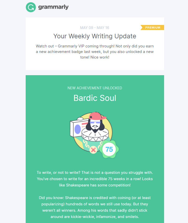
Email from Grammarly
Prioritize Mobile-friendly Design
According to recent studies, more than 70% of emails are open on cell phones these days. It goes without saying that HTML email design should be mobile-friendly. However, there is a hidden pitfall: email marketers often use responsive design and mobile-friendly design interchangeably, but they are not the same thing even though they have similar features.
When you create an HTML email, it is crucial to consider the design from a cellphone perspective. For example, when it comes to small screens, Apple recommends setting the typography to 16px since it makes characters legible and discernable. In contrast, the responsive design that is a one-size-fits-all solution implies only gradual changes in proportions. Therefore, we can often see mobile layouts where the font is set in 14px or even 12px size.
For some devices, responsive principles may work like a charm; however, if you want to ensure the best user experience for mobile users, it is vital to enforce the best practices for small devices.
Consider these ground rules of mobile-friendly design that every email marketer should know:
- When creating for iPhones, it is important to remember about retina displays that require you to use visuals (images and graphics) with high-resolution.
- Control elements like call-to-action buttons and unsubscribe links should be easily tappable. According to Apple, the tappable area should be at least 44px in width.
- All the necessary details of the interface (navigation, call-to-action, unsubscription link, and contacts) should be easily reachable. If you create an email design for cell phones and phablets, they should lie in the central part. If you create an email design for tablets (mini iPads, or landscape views in phablets), these details should be set on the sides.
- Maximize formatting. Make header length short. Break copy into small blocks that can be easily scannable.
- Do not use decorative fonts. Choose clean and simple typefaces.
- Avoid lengthy HTML body email. Do not make your users scroll. It is challenging to read long newsletters on small screens, especially on the go.
- Place the call-to-action button on the top and duplicate it in the bottom.
- Strike optimal contrast between background and foreground. Keep your designs high contrast because the email can be opened in bright sunlight.
- Do not rely on hyperlinks. They are tough to click. If it is possible, turn them into buttons.
- Do not make the hero image occupy the entire screen. Find the balance between the visual and textual information and show the main message on the first screen.
- Play smart with whitespace. Whitespace can easily make and break your design. Do not overdo. Too much whitespace makes the reading experience poor, whereas the absence of whitespace may ruin the entire user experience. The good practice suggests adding space around buttons, standalone links, and images and polishing line length and space between characters.
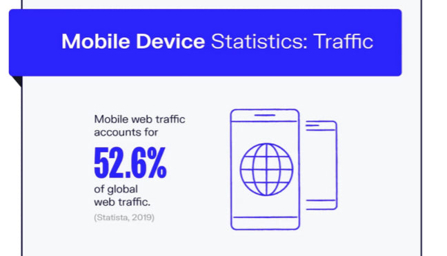
Mobile Usage Statistics Infographic
Focus on Personalization
One of the pillars of good email marketing states, if you want a newsletter to bring about high conversion rates, you need your customers to connect emotionally with your product or service. Without an emotional connection, you will not be able to tug heartstrings and achieve significant results.
The key to this connection lies in personalization that is realized through message and design. While personalization features (like the name of the recipient or an offer based on the client’s purchase history) speak to the user, the design frames this dialogue and makes this connection impactful and emotional.
Whatever design you are up to, it is crucial to personalize it. Analyze your audience, segment subscribers based on preferences, buying habits, gender, location, age, and adjust the design accordingly.
A good example of realizing personalization through the design is the usage of the proper color. As we know, people make a subconscious judgment about a product based on color. If you use the right color for your target market, you will reinforce the emotional connection with the audience and ipso facto increase conversion rates.
For instance, when you create an email design for a female audience, it is advisable to go for soft tints of blue and purple since, according to color psychology, women favor them. In contrast, a male audience will be delighted to see bright shades of blue and green, whereas teenagers mostly fall for marketing-established colors like pink or blue.
10 Golden Rules of Successful Email Designs
As we have already pointed out, to ensure the success of HTML email design, you need to know your audience, use segmentation and capitalize on personalization. However, that is not all; some other tips can be beneficial for your project.
Let’s consider practices that lie at the core of each successful campaign regardless of the niche and scale of the organization. They are ten golden rules of good HTML email design. Bear them in mind and try to implement them in each project:
- Create a strong subject line. A strong subject line can do a lot of good for your email marketing campaign. For instance, it helps the newsletter stand out in the inbox, ignite interest and compel users to open and re-open the newsletter.
On top of that, it helps the newsletter to see through spam filters because it is one of several factors that ESPs check before granting the newsletter access to the user’s inbox. If the subject line “smells fishy,” the receiving server will block the email.
Therefore, make sure your subject line is strong, unique, and valuable. For this, ensure it follows the basic rules:
- it does not include common spam phrases;
- it is straight-to-the-point;
- it brings value;
- it is personalized;
- it uses only legitimate characters;
- it is appropriately formatted.
- Check for broken links. Along with checking the grammar and punctuation of your HTML body email, it is crucial to ensure that all the links and buttons work. Broken links can ruin the user experience and become an obstacle to landing in the inbox since ESP considers them a spam sign. This is a common slip: across the emails we test, 22% contain a broken link, so a quick pre-send sweep puts you ahead of nearly a quarter of senders.
- Check for blacklisted links. It is bad to have a broken link, but it is even worse to have a blacklisted link. If your HTML body email includes links that lead to blacklisted or untrusted websites, then ESP may mark the newsletter as spam and reject it. Therefore, before sending out a newsletter, double-check sources and links you want your users to visit.
- Avoid short links. Although link shortening helps to reduce the size of the HTML file, however, it is also increasingly popular among spammers. Many ESPs are very suspicious about this technique. With shortening links, you increase your chances of being flagged as spam. Therefore, avoid them at all costs.
- Do not go wider than 600px with your layout. Although you can extend the area to 800px, if your target audience allows this, however, it will be much easier to ensure your HTML email works great across numerous devices with this safe option. On top of that, 600px width unobtrusively focuses the user’s attention on important information and helps the email newsletter feel valuable.
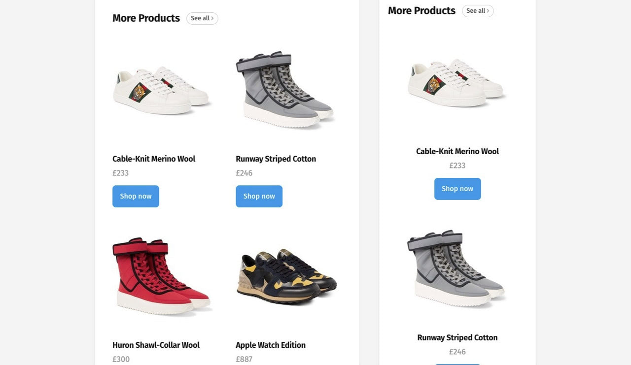
- Do not rely on images to deliver the message and avoid image-only designs. Although people eat with their eyes, making images the main visual driving force that delivers the message and makes an impression, still when it comes to HTML email design, not everything is that simple. The deal is, many mail clients block pictures from first-time senders, whereas others simply do not support this format. Therefore, relying on images can be a bad idea.
- Use safe fonts such as Arial, Comic Sans, Courier, Times New Roman, Trebuchet MS, Verdana, and Georgia. If you want to use one of the fantastic Google web fonts, make sure you have a fallback since mail providers do not widely support them. On top of that, put them behind a WebKit conditional media query to address issues with Outlook. Finally, specify font family, font size, and color explicitly so that the mail client does not overwrite it.
- Optimize HTML body email. Optimization is crucial for HTML email. If your newsletter exceeds a certain weight, the receiving server may reject it, considering it a cyber-attack. Therefore, it is highly advisable to minimize your code and optimize images.
- Spruce things up with psychological tricks. Several psychological tricks may help your HTML body email and design achieve the desired goal. For instance:
- Make sure the hero area supports the main offer with an impactful image.
- Use the inverted pyramid principle to deliver a message and compel users to click on the button in a non-intrusive way.
- Add dynamic elements like image and button rollover effect, tooltips, radio buttons, transitions to enrich user experience.
- Use animated gifs to leave a long-lasting impression. Email clients widely support them so that you can use them without much concern.
- Adapt interactive features and impress your visitors with a gamified experience. Although interactive features have some issues with compatibility and support, many new versions of email clients can serve them. Therefore, if your target market uses the latest Apple Mail and Gmail version, they will certainly enjoy the action.
- Never use such things as:
- Flash;
- JavaScript;
- Videos;
- Audio;
- Forms.
They have minimal support or no support whatsoever.
HTML Email Development Best Practices
To enjoy all the benefits of email design, you need to ensure that the core of the newsletter (structure, layout, and functional units) works as intended. Therefore, follow the best practices for HTML email development. This matters more than most senders realize: across the emails we test, only 30% pass our HTML best practices check, which means the vast majority leave room for rendering and deliverability problems that the steps below help you avoid.
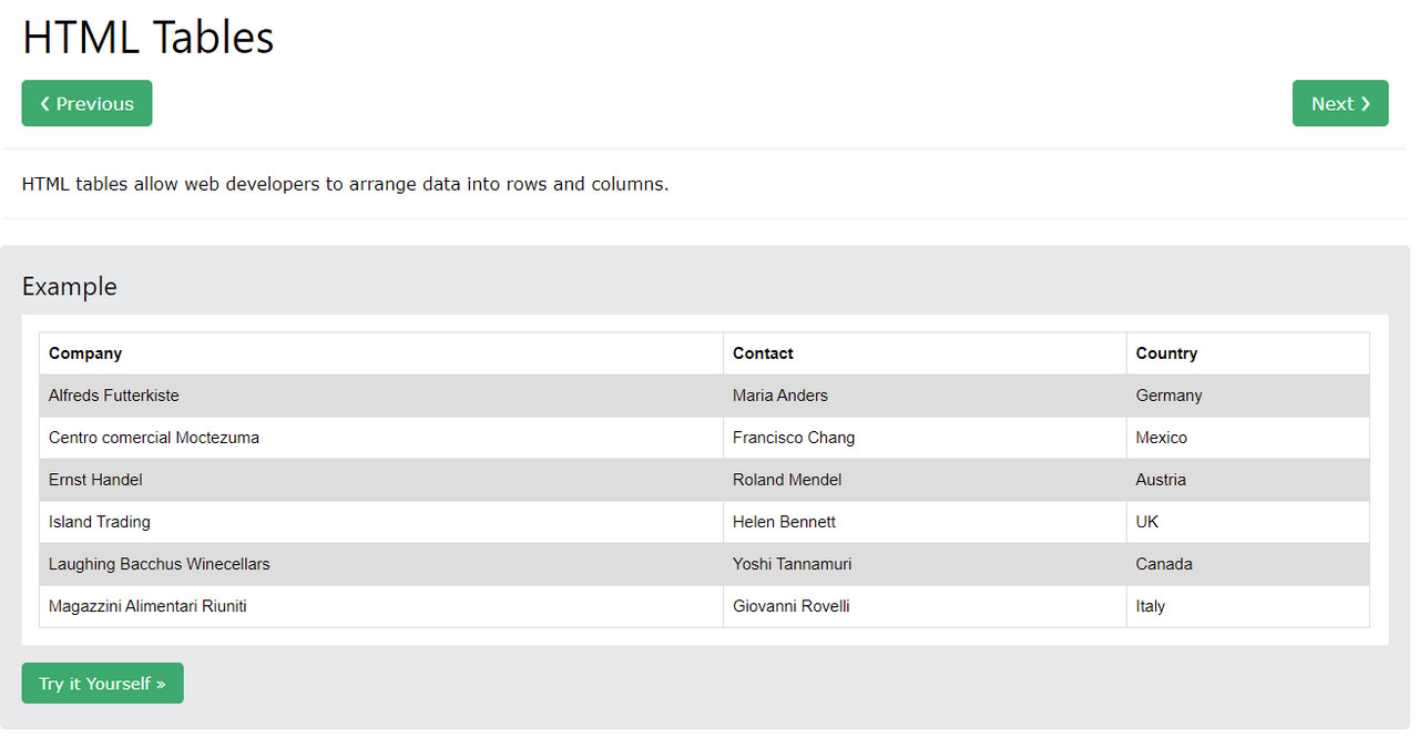
Maximize on Tables
As much as you want to use flexbox or grid in your HTML layout, unfortunately, it is impossible since email clients do not support these unique CSS features. Although you can try to use divs and floats, however, their abilities are also limited. Therefore, all you can do to play safe is to use tables. They are the most reliable tools to create a layout.
When using tables, remember that the general advice is, keep it simple and stick to a one-column structure. However, you can try two and even three-column layouts if you send newsletters to the audience that uses desktop or notebooks to open them.
To build a complex structure, you can nest tables. However, you need to bear in mind several important things:
- Use the “align=left” attribute with a fixed width for each table to arrange them horizontally.
- Avoid empty table cells since some mail clients may wrongly interpret them. Instead, you can use a non-breaking space character with a size set in CSS.
- Eliminate any spaces in between the tags since they can break the layout.
- Maximize on table’s native attributes like cell padding, valign, align, and width to set dimensions or position elements inside cells.
- Use one parent table.
Exercise Caution with CSS Styles
CSS styles are one of the weakest spots in email development. The majority of CSS3 modern features are widely unsupported by mail clients. In addition, there are many no-nos for styling. For example, you need to stay away from such general practices as:
- compound style declarations;
- shorthand declarations;
- complex selectors;
- pseudo-elements;
- layout properties.
That is not all; when it comes to using styles in HTML, it is here where you need to use inline styles: a practice that is widely considered bad for website designs but turns to be a lifesaver for email designs.
To make matters worse, if you want to play safe, then it is better to use
- CSS2 instead of CSS3,
- HTML-attributes instead of CSS,
- padding instead of margin,
- background-color instead of background.
Be Responsive
Responsive design is one of the most crucial HTML email best practices since the mobile web is in charge these days. Here are the main recommendations that help email design to adapt to various screen sizes graciously:
- Use one column layout to avoid reorganizing elements that can be tricky for nested tables.
- Use media queries to polish design for every vital breakpoint.
- Resize images to fit the screen. Also, center images so that the vital information hits the eye instantly.
- Adjust font size according to each breakpoint. Remember, small screens require a bigger font size than you think. Also, make sure letter-spacing and line-height create an optimal reading experience.
There are several ways to pull off responsive design: media queries with a set of breakpoints and fluid layout with calculations done on the CSS side. Each approach comes with its cons and pros.
Check out these helpful articles to get a solid start:
Last but not least
When creating a responsive design, it is vital to stick to the standards of good code, such as:
- keep your code as light as possible;
- keep your code clean;
- structure your code;
- add commentaries;
- check and double-check not only logic and structure but also syntax.
Example of Responsive Email Design
Deploy Authentication Protocols
Authentication protocols (SPF, DKIM, and DMARC) provide a security layer for your emails. Although they are not obligatory, however, they are highly recommended for every company. There are several good reasons to enforce them:
- They help to fight cybercrimes.
- They help to establish a clear and transparent connection between subscribers and sender.
- They help to increase your sender reputation that in its turn improves deliverability rates with services and open rates.
- They make companies even with a low reputation look reliable.
- They allow companies to establish a policy concerning rejected newsletters.
- They give insights into what happened in the sender-recipient ecosystem.
- They give you a fighting chance to land in your inbox, because most ESPs use them as the main factors to decide on the fate of email.
SPF, DKIM, and DMARC are secret ingredients that help professional email marketers to ensure their emails get to their destination safe and sound. Therefore, they should be in place.
Set up List-Unsubscribe Header and Reverse DNS Lookup
Along with authentication protocols, there is one more thing that you need to do with your mail server administrator. It is to set up a list-unsubscribe header and reverses DNS lookup.
Although these two mechanisms are not related, they still work towards the same goal, that is, making your email look trustworthy and your company look reliable.
Let’s consider them a bit closer.
List-unsubscribe header is an email header that includes the command to unsubscribe users directly from a mailing list. It has instructions that tell email clients what mechanism they should embed to the email so that users can quickly and painlessly opt out from the mailing list. Note, an unsubscribe link inside HTML body email is not enough these days. To make your users feel comfortable in your relationships and ensure ESP that your company follows the law, it is important to set up a list-unsubscribe header.
Reverse DNS lookup is a querying technique that maps domain names and IP addresses. It lies at the core of many analytics instruments. It is also one of the many factors that ESP considers when deciding on the authenticity of your newsletter. If reverse DNS lookup is not configured, ESP may easily reject the email from this server. Therefore, you need to ask your mail service provider to set it up for your domain because it is not configured by default.
Check Blacklists
No one wants to deal with companies that are blacklisted, and no one cares how it happened. Your reputation is everything: it should be flawless. End of story. Therefore, blacklists can be a real curse. They can destroy everything, starting from your sender reputation in the digital expanses and ending with a brand reputation in the real world. They have such bad implications for your brand as:
- damaging of sender reputation;
- damaging of brand reputation;
- loss of profit;
- loss of customers and fans.
The main problem with the blacklist is, it is ridiculously easy to get into the blacklist and become blocked. For example, if you overstep the bounds of HTML email best practices, or get carried away during the holidays and send too many emails to subscribers, you can quickly get yourself into trouble.
The second big problem with blacklists is that you are not notified that you are in. You are left in darkness while the blacklist begins to destroy your sender reputation and nullify deliverability rates and open rates.
The third problem is, there are more than one hundred blacklists on the web: Malware Blacklists, DNS Blacklists, IP Blacklists, Phishing Blacklists, Spam Blacklists. They have their policy and criteria. Of course, not all of them have the same impact on your campaign; however, eventually, even the unpopular blacklist can ruin your marketing strategy.
So, it is crucial to stay away from blacklists. As one of the HTML email best practices states, check blacklists regularly and act quickly. For example, you may use such tools as
- Unspam.email,
- Spamhaus Block List,
- Barracuda.
If you are in, do not panic. Visit the official website of the blacklist provider and familiarize yourself with the protocol of getting out. Fix all the issues with your campaign, domain, IP, and mail server and register a request to be delisted.
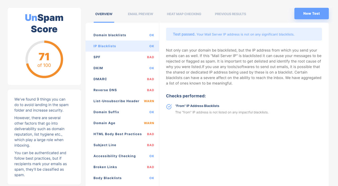
Blacklist check by Unspam.email
Advocate Accessibility
Accessibility always stays overlooked by email developers, mostly because they consider this aspect a prerogative of web design. However, your digital newsletter should also be accessible by any person. Impairment should never be an obstacle. It is also more attainable than its reputation suggests: across the emails we test, 84% pass accessibility checks, so the practices below are well within reach for most senders.
Therefore, follow these HTML email best practices to ensure a proper level of accessibility:
- Adopt semantic code. Proper formatting like using
tags for header or tags for paragraphs help screen readers to interpret HTML body email correctly. This also improves the readability experience and lets a user easily navigate through the content.
- Set all the essential attributes. This includes the “lang” attribute for defining language, “title” tag for defining the title of the email, and “Content-Type” with the “charset” meta tag to encode characters properly. Not only does this procedure help to avoid breaking the reading pattern for a subscriber, but it also ensures HTML body email is valid from a coding point of view.
- Set Alt text when it is needed. Setting alt for images is a widely-known practice. However, it is important to understand that not all photos require it. Alt texts are mandatory only for elements that bring value to the reader. If the picture is redundant, then it should not have alternative text since it is useless. The same goes for decorative elements or graphical material that plays the role of mere aesthetic detail. Also, note that alt text can be styled.
- Ensure optimal contrast. According to WCAG 2.0., it should be at least 4.5:1.
- Ensure proper information hierarchy and logical structure for HTML body email.
- Capitalize on ARIA. Accessible Rich Internet Applications are a powerful mechanism that helps screen readers understand the situation better. Follow these time-proven tips:
- Set role to” Presentation” to each table involved in building the layout.
- Set role to” article” for each chunk of information.
- Set role to” img” for each image.
- Set role to” listitem” to indicate a list.
Check out Email Design Accessibility: Why It Is Important to Improve It for more information on this subject.
Test Everything
Whatever you create, it is crucial to conduct regular tests. It is one of the most important but sadly overlooked HTML email best practices. Regular checks ensure everything is fine with your email and campaign. Therefore, before sending email to your customers make sure you have done these things:
- Check grammar. No one likes typo in the HTML body email. It makes your brand looks incompetent and cheap. Follow the checklist in How to Create and Verify an Email Newsletter Before Sending to ensure HTML body email is error-proof.
- Check device compatibility to figure out what rendering issues you missed out on. It is one of the most significant issues since ensuring your HTML email works consistently throughout all popular email clients, devices, and browsers is a nightmare. Even if you have done your homework perfectly and segmented subscribers according to device usage, it is still important to make sure your design looks good whatever comes its way. If preview-across-clients pricing is a concern, our Litmus alternative covers the same rendering checks without the heavyweight cost.
- Check for blacklists and spam. Consider this helpful article, Verify Email Newsletters for Spam and Test Deliverability, to get more information on this matter.
- Check the overall score of your HTML email. It is time to go deeper into the health of your current email marketing campaign. Using such professional tools like Unspam, you can quickly figure out things that may cost you a place in the subscriber’s inbox. Unspam checks such vital aspects as
- security protocols like SPF, DKIM, and DMARC: whether they are correctly configured;
- subject line: whether it is spam-proof;
- HTML body email: whether it follows the best practices so that it does not trigger spam filters or blacklists and much more.
Last but not least, do A/B tests. Polishing your HTML body design is not enough to ensure the campaign’s success; it is crucial to understand how your subscribers react to the newsletter’s design, offer, and work since every taste is different. An email heatmap makes this reaction visible, showing exactly where readers focus and click so you can move the call-to-action to where the attention already is. For this, you need to run A/B tests. They will give you clues about what should be included inside your newsletter to get a proper response from your subscribers and turn prospects into buying customers.
Simple Ways to Create HTML Email
The great thing about HTML email development is that no one said that you have to do everything yourself. Creating a decent email is a challenge: there are so many practices to follow, so many instruments to involve, and so many checks to do. However, you can easily see through with some assistance.
For instance, if you have coding skills, you can enjoy the benefits of pre-made HTML email templates that provide a reliable foundation to build on. Check out these Free HTML Email Templates.
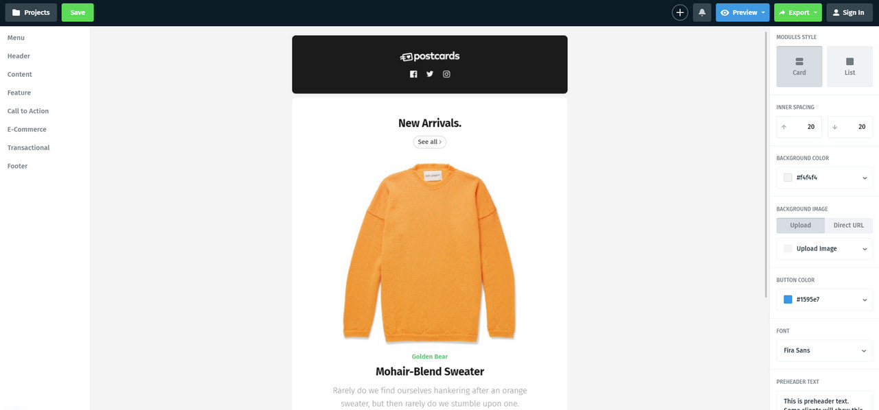
If you do not have any tech skills, you can delegate this task to the tools that do all the heavy lifting, like Postcards. Postcards is one of the most popular and trusted assets of email marketers all around the World. It has an intuitive drag-and-drop email template builder, hundreds of beautiful hand-crafted field-tested units, handy customization options, and lots of features like version history or native integration with popular ESPs like Mailchimp. It is also our top pick among the best email template builders for 2026.
Conclusion
Let’s be honest; email design has stuck in the dark ages. We can’t use modern CSS features or implement JavaScript to provide fallbacks. We are left with scarce solutions that do not even render similar in all email clients. As a result, we should face many challenges while creating a decent email design. However, it does not mean we cannot nail it.
To see through all the obstacles, it is essential to follow HTML email best practices (they make a huge difference in how your newsletter displays in different clients and how your target audience respond to your campaign) and, of course, benefit from tools that were created to help email marketers to feel solid ground under their feet.
