

Do you know what makes a high-performing email campaign? You might say: eye-catching product display, personal discount, valuable content, or entertaining experience. As a professional email marketer, you may add high deliverability, accessibility, responsiveness, mobile-friendliness, quality of subscription list, segmentation, marketing strategy, and even capacity of the marketing platform.
However, at the end of the day, when the user opens the email, everything boils down to content and design and how well they were made. Indeed, many factors play a role in creating high-performing emails, but these two are the most crucial. As a proof, consider this:
- According to recent studies, over 80% of marketing leaders put content at the core of email campaigns, seeing it as a decisive factor in achieving marketing goals.
- Another study showed that interactive components like forms, image carousels, and questionaries drastically escalate response rates.
- Finally, HTML emails with multimedia have a higher open rate and conversion rate than pure text-based.
So, well-thought-out email content and design are a path to success.
Let’s discover the importance of creating email content and design for deliverability, common mistakes marketers make, and the best ways to fix them to enjoy the potential hidden in email marketing.
Check Inbox Placement
Before you hit send, run an inbox placement test to see whether your design actually lands in the primary inbox or gets diverted to spam and promotions.
Press play to load this video from YouTube (Google). See our cookie policy.
Why Is It Important to Design and Write Emails Thoughtfully?
So, why creating email content and design for deliverability is so important? There are many reasons for that.
First and foremost, despite all the hustle around social media, email marketing is still the most crucial part of digital marketing. There are over 300 billion businesses, and customer emails are sent and received daily. Not all of us have social media accounts, but most have email. According to MarketingProf’s, 93% of B2B marketers use email to distribute their content.
Second, a well-thought-out email campaign goes a long way:
- It instills trust, enhances customer loyalty, and increases the company’s credibility, thereby helping fight competition.
- It offers better customer outreach.
- It builds a strong brand identity and cements the company’s position in the market.
- It nurtures subscribers and prolongs their life as a customer.
- It builds strong and healthy relationships with customers prolonging the company’s life.
- It increases revenue generated per customer and contributes to the company’s revenue.
- It has one of the best returns on the investment rate.
Third, content is always king. Whatever imaginative or creative you are with email design and marketing campaigns and strategy, in the end, everything boils down to the value that users get. It is here where content comes into play. Since it can take many forms (articles, infographics, videos, images, animations, and even interactive units), it can accomplish various tasks. For instance,
- It engages, informs, enlightens, and even inspires.
- It delivers the right message at the right time to the right person.
- It steps into the subscribers’ mindsets.
- It keeps users up-to-date.
- It satisfies customers’ pain points at every stage of the journey.
- It meets the audience’s needs, requirements, and expectations.
In a word, it is a lead generator engine that escalates open rates and click-through rates.
Fourth, design is a tool that amplifies the effect that content produces and accomplishes lots of crucial tasks on its own:
- It allows the reader to navigate the content as the marketer intends.
- It catches the reader’s eye and makes the most of the viewer’s short attention span.
- It increases the willingness to keep reading.
- It transmits to the brain the majority part of the content.
- It makes the vital first impression that enlarges the time spent on email.
- It produces a favorable long-lasting impression that is referred to as the Recency Effect. Simply put, it creates powerful memories that return to subscribers when they think about the brand.
- It ensures responsiveness and mobile-friendliness, letting users get information on any device type and screen size.
- It reflects and reinforces brand identity, mission, and values.
- It touches upon readers’ emotions.
- It creates a user experience.
- It makes email inclusive.
- It increases engagement.
Finally, well-thought-out email content and design offer more profound long-term benefits with lower initial costs. They are much cheaper to maintain than other channels of distribution and communication. From a financial point of view, they are the most beneficial and promising.
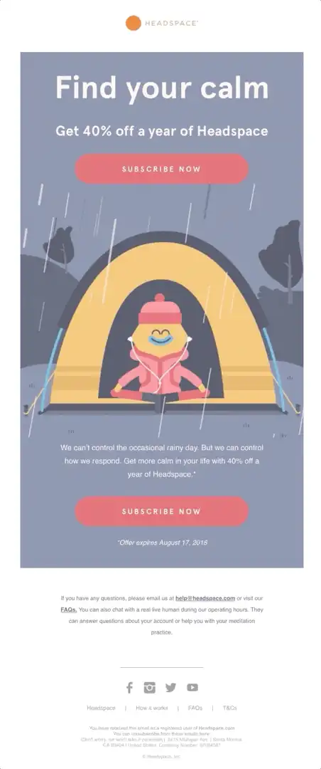
High-performing email from Headspace
Common Mistakes When Creating Email Content and Design for Deliverability
Email marketing presents numerous challenges that need to be triumphantly met to enjoy its benefits. From finding a reliable marketing platform for effectively analyzing customer behavior and running hyper-personalized campaigns to using professional instruments to discover deliverability issues like Unspam, there is a slew of obstacles to face and mistakes to fix. However, today we will focus on those that slow down and interfere successful creation of email content and design for deliverability.
Common mistakes in email content
When it comes to email content, there are several serious mistakes:
- Poor email subject line. Without a strong pitch, your email will not have a chance to start a conversation.
- No purpose in the content. The goal should stand behind every email. It needs to be precise and carefully delivered to the subscriber.
- No personalization. This is the biggest, if not the worst, mistake marketers make. Staying neutral and sticking to a non-personal approach was a good practice a decade ago. However, today, so-to-say customer intimacy generates faster revenue growth rates than every other trick. Hyper-personalization is a top priority for all types of email campaigns, from onboarding to cold emails.
- Too much content. It is so tempting to add animations, visuals, and interactive features. However, this should not be done because content overload (especially the one caused by visuals) is real. Email is meant to be scanned.
- Use of ambiguous language or industry slang. This confuses and creates the scope for misunderstanding.
- Missed the signature in the email. We are not talking about the digital signature that secures the email connection (it should be done, full stop); we are talking about standard sign-off with your name and relevant contact information. Its absence decreases trust and causes some additional issues, including legal ones.
- Poor formatting. Creating an information hierarchy and formatting the text according to the best practices sounds like a lot job for a small digital newsletter. However, poor formatting brings poor readability that, in turn, brings about poor user experience and overall impression.
- No descriptions for images. Images are content whose context must be delivered to every person regardless of their ability and capability to see the picture. When you miss alts and descriptions, you lose your subscribers.
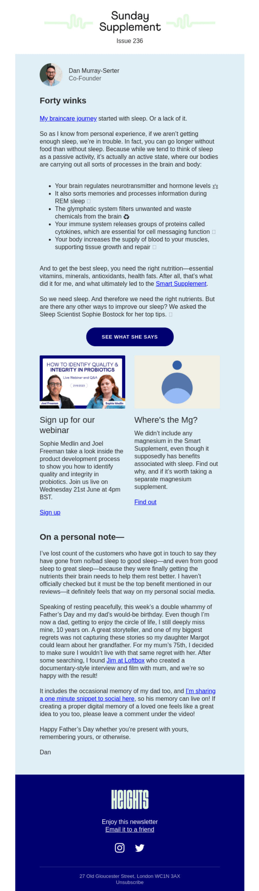
Email from Heights, TL;DR;
Common mistakes in email design
Here is a list of the most common mistakes in email design that decrease open rates and engagement.
- Too long email. It is so tempting to deliver as much information as possible at a time; however, whatever beautiful design you are up to, nobody likes scrolling. Plus, it may heavily impact the newsletter size and force email readers to shorten and curtail the content on their own.
- Too much interactivity. Although website-like email design is a warmly-welcoming approach, bombarding viewers with interactive features within such a small space brings about a negative impact. Plus, many email readers do not recognize them yet, marking newsletters as spam and quietly eroding your newsletter deliverability.
- Too complex reading paths. It is easy to get obsessed with content and forget the smooth reading path, leaving users confused and clueless about what to do next.
- No navigation. Without quick getaways to the most critical information, users will lose their freedom to move and access data to proceed with their tasks.
- No visual hierarchy. Chaotically scattered images and offers throughout the email lead to confusion and uncertainty in actions.
- Overplaying with fonts. Some email designers use too many decorative or impressive type families, overwhelming visitors and destroying readability.
- Mistaking responsiveness over mobile-friendliness. These two terms are often used interchangeably. However, they are not the same thing. Both should be realized in the email.
- Ditching accessibility.
- Not testing and validating email.
Best Practices for Creating Email Content and Design for Deliverability
Many companies try to create email content and design for deliverability. However, not all of them succeed because many factors must be considered. Start with adopting these best practices to establish a solid foundation for building up a high-performing email.
Best Practices for Email Design:
- Prioritize navigation. Readers should get to the information quickly and painlessly. No more than two clicks away is your golden rule.
- Create a clear reading path and reinforce it with properly defined navigation.
- Add interactive features with caution. Take one step at a time. The same goes to visual material. Use it sparingly.
- Always feature crucial images and content first. For instance, make it the first slide in the carousel or header background.
- Add brand identity elements to the header and footer.
- Play with the font face carefully. Remember, decorative typefaces are suitable only for titles. Choose one or two fonts per email. Also, ensure legibility of letterform, a good line, and word spacing.
- Follow principles around visual hierarchy. Try a time-proven inverted pyramid: start with an attention-grabbing poster, build anticipation or generate excitement, and add a call-to-action button at the end.
- Create a mobile-friendly design. Optimizing user experience for cell phones is crucial: almost 80% of users will delete email if it does not display correctly on their mobile phones. Therefore, at least use a one-column structure, increase the font size, and provide comfortable tap areas.
- Introduce accessibility principles. Go far beyond adding alts to images. For instance, create a structure with sections and articles and hit the optimal contrast ratio. This is more achievable than many marketers assume. Across the emails we test, 84% pass accessibility checks, yet only 30% pass HTML best practices, so the markup itself is where most designs slip.
- Test emails using professional instruments like Unspam, a lightweight Folderly alternative, to see how they display, work and behave in different inboxes, operating systems, and device screens.
- Check and validate emails.
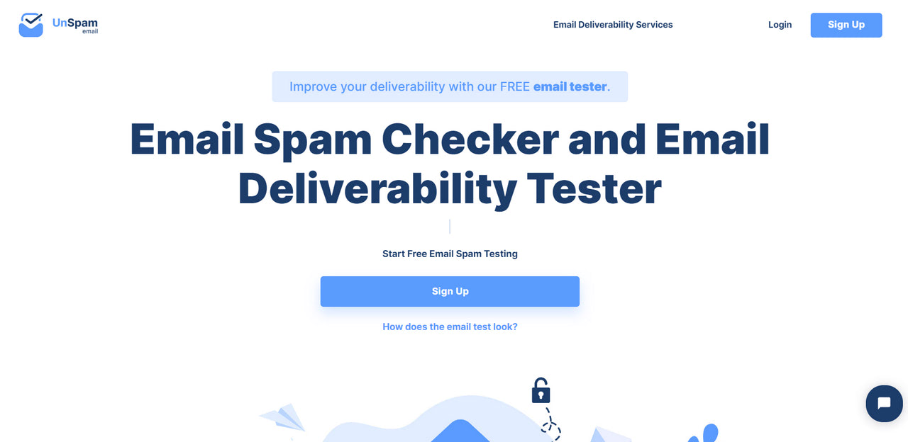
Unspam: professional email spam checker and deliverability tester
This list of the best practices is actually much longer. It is constantly replenished with tips to meet the current state of email design standards. However, if you do not have time to adopt them on your own, you can address email design to professional instruments, like Postcards.
The Postcards is a no-code email builder that is perfect for non-tech-savvy users. It comes with crucial tools for building email templates from scratch simply by dragging and dropping necessary blocks into the playground and customizing them via an intuitive dashboard. Creating a finished product that meets all current standards will take just several minutes with it.
Best Practices for Creating Content
-
State the topic of your message in the subject line and make it engaging, inspiring or personal. This is where a lot of campaigns stumble: only 56% of the emails we check pass our subject-line quality checks, so a sharper subject is one of the easiest wins available.
-
Ensure your preview text contributes to the cause and logically continues the subject line.
-
Add a personalized greeting.
-
Keep content concise, to the point, and easy to understand. According to stats, shorter copy results in higher response rates.
-
Take a closer look and pay more attention to your word use. Avoid jargon, industry slang, pretentious language, or abstract or too sophisticated words.
-
Avoid visual overload. Studies show that the optimal ratio of images and text is 4 to 1. Although you may increase the number of images using interactive components like carousels or accordions, it may still overwhelm and scare away your viewers.
-
Sign off your email. Add as much contact information to the footer as possible. At a minimum, ensure you have listed: the company’s name or your full name, website, phone number, physical address, links to active social media profiles, and an unsubscribe button.
-
Format your content. This can be done in numerous ways, but the most important of them are:
-
Create an information hierarchy.
-
Give an ample amount of white space.
-
Stick to a neutral font face and legible font size for the body copy.
-
Use the list to structure data.
-
Stay away from long paragraphs.
-
Use bold text for key points.
-
-
Use graphical elements to illustrate relationships in the data or serve too numerous or complicated information in digestible form.
Last but not least. Personalize everything. The closer company gets to the consumer’s needs and expectations, the bigger the gains. Personalization touches every aspect of the email (content, design, subscription list, and even marketing strategy). It deserves a whole article. However, briefly, it implies the following: create personalized content, greet with the name, customize the subject line, employ triggers, use dynamic content, and stick to the best time and frequency.
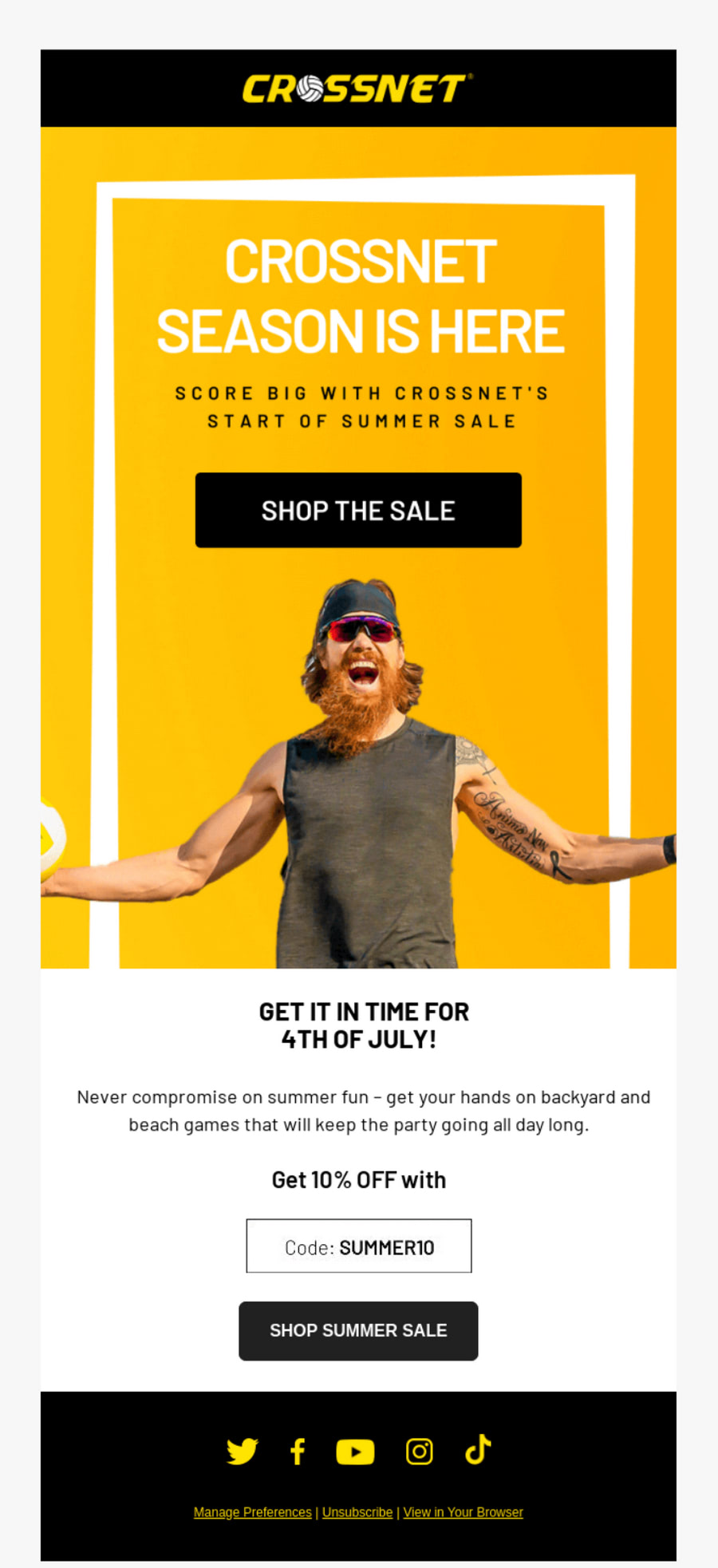
High-performing email from Crossnet
Examples of High-Performing Email Campaigns
Let’s consider three examples of high-performing email campaigns to see how companies are managed to create email content and design for deliverability in different niches and for different purposes.
Email from TerraSoul
This promotional newsletter from TerraSoul is a representative example of a high-performing email design where every detail plays a crucial role in conversion. Let’s break it down to see what the marketing team has done.

First, they have followed the inverted pyramid principle to display content. You may notice that the newsletter starts with a carefully delivered offer. Afterward, you may see an eye-catching product image, which ends with the call-to-action button. The team grabs the viewer’s attention, inspires, and leads to the point where action should be performed.
Second, the team has personalized the email: “10%, Just for You”. Who could miss that? Especially when it is stated twice: right in the subject line and in the greeting.
Third, the team has added a powerful signature. Not only have they featured contact information, but most importantly, they have reminded subscribers about their mission playing a card of “brand identity.”
Finally, they have made email responsive and mobile-friendly.
The team has aced numerous key factors, delivering value and effectively dragging users into a funnel.
Email from Burger King
Email from Burger King also shows us how to create email content and design for deliverability. It is a relatively small yet powerful blast that naturally resonates with the audience and reaches its prime marketing goal: generating leads. So, what team has done?
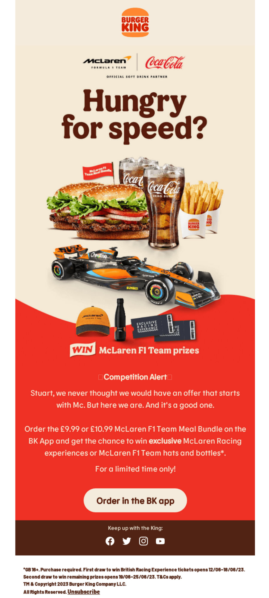
First, the team has produced a powerful visual impact from the first seconds. Notice the header image. It is just remarkable. It is juicy, impressive, and undoubtedly delicious. It shows the brand’s products in the best possible light and simultaneously echoes the event’s sports theme. Smart combo. It certainly appeals to all F1 fans.
Second, again the team has used the principle of an inverted pyramid.
Third, the team has made the email content concise. Only offer and nothing else is featured inside the newsletter.
Fourth, the team has signed off on the email. Even though their footer is much less informative than in the previous example, it is enough to inspire trust and avoid most spam complaints.
The team has certainly hit all the essentials.
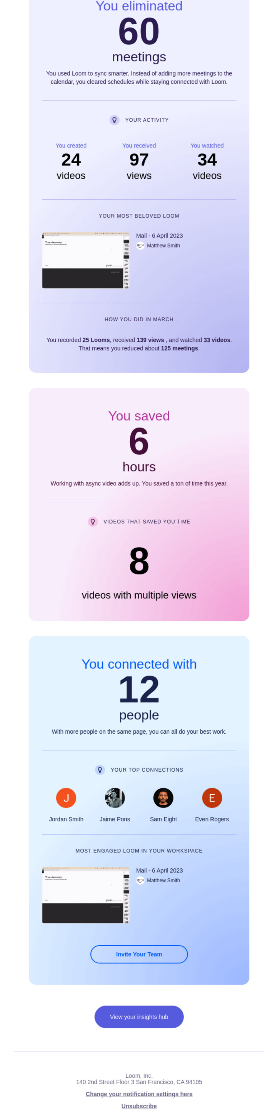
Email from Loom
The newsletter from Loom is vivid proof that even long emails that call for scrolling may hit a high deliverability rate, resonate with the subscribers and benefit the company. How could it be? Simple. This approach works only when everything said and featured in the newsletter concerns the subscriber. People like to read about them, and the email marketing department of Loom knows this perfectly well. Therefore, they have done several crucial things:
First, they have dedicated the newsletter to the subscriber totally: no offers, not a single word about a product, except in context with the user.
Second, they have personalized it from top to bottom. Every piece of information reveals stats about the customer.
Third, they have made it entertaining and inspiring. Information is skillfully broken into blocks and styled and formatted to lead users all way long and keep them interested.
Finally, they have added some crucial links and information for better navigation.
Conclusion
Creating email content and design for deliverability is crucial for many reasons. It improves open rates, resonates with the audience, drives engagement, generates leads, and brings value to customers and brands. Per se, every campaign should be done with this rule in mind to achieve marketing goals.
However, that’s easier said than done. Creating high-performing emails comes with numerous obstacles to overcome. Email marketers should closely work with the subscribers to understand their preferences and behavior patterns. Regular analysis, keeping up with market trends, and, most importantly, adaptation of the best practices helps them develop content and design that resonate and ipso facto meet the highest deliverability expectations.
